Every year is full of new possibilities and, of course, new trends to watch for in design and fashion. We like to focus on specific stationery trends (which often end up being wedding invitation trends) and how other trends may impact stationery design. So let’s go over some of our favorites we’ve been seeing from all of you and are predicted to be popular this year.
10 Stationery Trends to Watch For
1. Sherwin Williams Color of the Year
Although Pantone’s color of the year gets more of the limelight, we’re always excited to see what Sherwin Williams’ color of the year is as well. This year, it’s Upward (SW 6239. 224 C-1) and we love this shade! It’s a subtle color that’s both soothing and stunning; an excellent go-to neutral for wedding palettes.
“A sunny-day shade for spaces brimming with positive energy, creative thinking, and total contentment.” – Sherwin Williams Team
2. Wildflower Whimsy
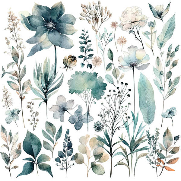
We see some really gorgeous wildflower artwork come through our presses, so we are not at all surprised by this trend. The brilliant colors, the crisp details, the organic beauty of every leaf and every flower petal. Again, this is a hot trend for wedding invitations but we see it a lot on personalized stationery like note cards and greeting cards.
3. Old Money Vibes
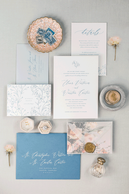
I’m not sure there’s anything new about this stationery trend other than the name. The phrase “Old Money Vibes” really captures a very distinct look and feel. There will always be a significant market for this style of stationery. It’s simply timeless. The sample above from Katy Jahn and Happy Day Co. brings together sophistication and natural beauty, and it’s all finished with an elegant gold seal.
4. Wedding Crests
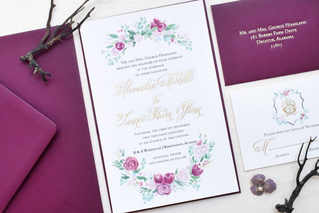
Wedding crests are different than monograms. A wedding crest may or may not include the couple’s initials. It could contain symbols meaningful to the couple or it may just be a pretty design element they use throughout the wedding stationery and décor. Wedding invitation designer, Laura Beth from Swag, created a striking crest on the response card of this wedding invitation suite.
5. Western Motifs
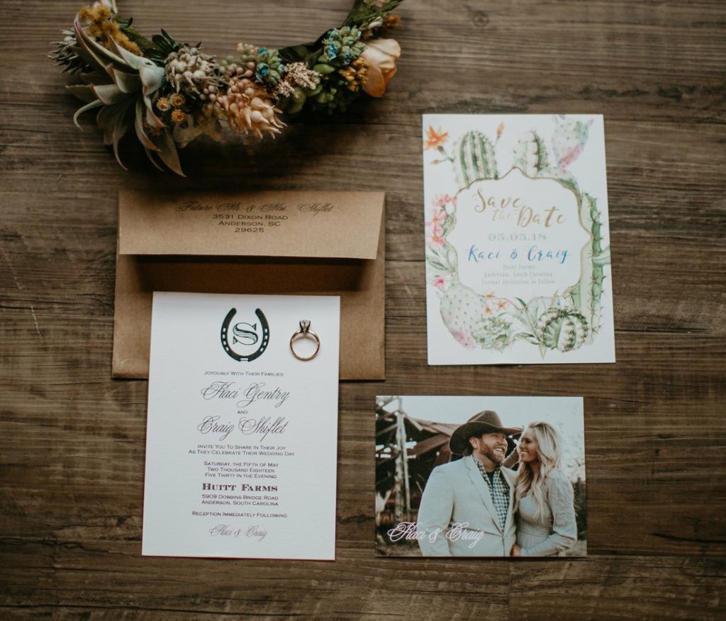
We can’t create a list of stationery trends without referencing Wedding Trends from the Knot and something they made sure to highlight is Western motifs. We’ve definitely seen an uptick in Western-inspired artwork both traditional and modern. We’re seeing this stationery trend across all types of stationery. It’s a good reminder that what you put on paper is a reflection of your heart and soul, and there are few American sub-cultures as proud of their roots as cowboy culture. Check out the charming stationery collection above with Western themes by Lauren James from Olive Shoe Paperie and Goods.
6. Ceremony Friday, Party Saturday (Multi-Day Stationery):
The wedding world is seeing a huge increase in weddings on Fridays and Sundays. Here at TOG.ink, we have seen a lot of wedding weekend itinerary cards come through. Designers are creating them on everything from your typical A7 flat card to the long and slim #10 flat cards or unique folded cards like tri-folds and z-folds.
7. Drone Shows
I snuck this into the mix because it’s a great example of how technology is shifting various aspects of our culture. Even though nothing will ever replace the magnificence of fireworks, drone shows bring a high-tech show-stopping performance like we’ve never seen. This may not be a stationery trend specifically but I would sure like to see someone interpret this wedding event trend into stationery like thank you cards, perhaps with some traditional or enhanced foil.
8. Meaningful Menus
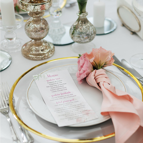
Meaningful menus is my personal favorite on this list! I hate to call myself a foodie because I think that somehow implies I have a sophisticated palette and/or methodical cooking methods. I possess neither of those things but I do have a passion for the memories made around a dinner table and the feelings that come with certain foods. A menu of food options that really means something to the couple truly touches my heart, and we have all the flat cards and specialty print processes you want to create something wonderful for your clients.
9. Illustrations
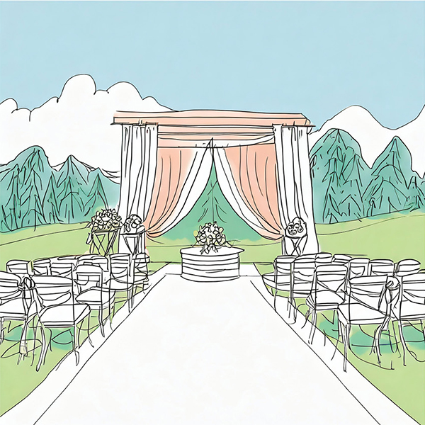
Illustrations have been growing in popularity for several years now. We see lots of architectural illustrations on wedding invitations, art prints and note cards, but we’re starting to see a lot more illustrations of people and pets, especially on cocktail napkins.
10. Pantone Color of the Year
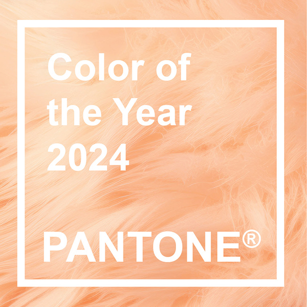
Last but certainly not least (you’ve probably seen it all over the place) is Peach Fuzz, the color of the year by Pantone. I am not as enamored with the name as I am with the color but that’s okay; the color speaks for itself!
“It’s a velvety gentle peach tone whose all-embracing spirit enriches mind, body, and soul.” – Pantone Team
Leave a Reply