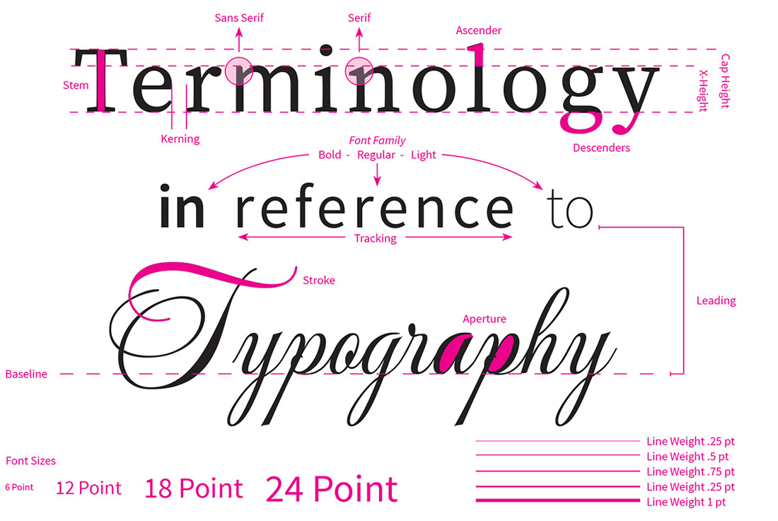
Studying paper and print is our life here at TOG.ink. The team is designing, testing and printing all day every day, and believe it or not, we find ourselves revisiting the basics on a regular basis. Especially when it comes to typography and print. Why? Because understanding the fundamentals of typography is so essential to creating a quality print service anyone can use.
Typography Tips when Designing for Print
Here we’re laying out some designer tips around common issues regarding typography we have to watch for both in our own work and the work that comes through our printers.
Tight Kerning and Tracking
Setting the kerning or tracking too low could result in text running together, especially when designing for foil printing and letterpress stationery. These print processes result in thicker strokes, which means a design that looked nice printed digitally may not look crisp and clean when printed in foil. Adjustments may need to be made to kerning, tracking or line weight. When text runs together, that is considered a registration issue. Proper registration means any impression (ink, foil, letterpress) on the paper occurs exactly where it is intended.
Tracking refers to uniform spacing between letters, which remains uniform when changed. Kerning also refers to spacing between letters, but the spacing is not uniform. Kerning allows for varying spaces as long as the result is visually appealing. Designers may play with kerning and tracking to fit wording into a confined area but this should be done with caution when designing for foil stamped or letterpress stationery.
Small Point Size
In the Artwork Specs Grid, we tell customers that “extra small text may cause registration quality issues”. We would love to give a minimum point size but with the vast world of fonts out there, we really can’t. Each font, even within a Font Family (also known as typeface), can look drastically different at the same point size.
Not to mention how much a font can change when adjusting stroke weights. The stroke being one of the lines that comprises any given letter, whether straight or curved. Increasing stroke may achieve the desired look digitally but again this can jeopardize the print quality of the piece depending on the print process you’re using.
We highly recommend putting through a test order if you’re uncertain. We offer a low minimum of 10 for most items, which means you can create some pretty sweet test sheets (like above) to get an idea of the possibilities.
Serif Fonts
Serif fonts at small point sizes can cause issues with foil printed pieces. The serif, which are the tiny feet or lines connected to the ends of strokes in letters or symbols, can be too delicate to have the necessary surface area to allow the foil to stick to a given stock. This results in small portions of the wording or design “breaking” or missing.
Serif fonts are often used in books, magazines, and newspapers since they are considered easier to read in long-form use cases. If you’re considering a serif font at a smaller point size for a printed business material or stationery piece, once again we recommend a test order to determine just how small you can go with that particular font.
Tight Leading
A term that dates back to hand typesetting, leading originally referred to the thin strips of lead (or aluminum) that were inserted between lines of type to increase the vertical distance between them. This spacing is now done digitally but the same characteristics apply.
Leading relates to the spacing in between the baselines of type. From one baseline to another. In print, leading can cause similar issues as small point sizes and reduced kerning or tracking. However, it’s less likely the letters and words will run together because the naked eye can pick up on those problems of spacing between lines better than it can spacing between individual letter. What can happen is if you’re not used to print processes like foil printing, letterpress or embossing, you might feel like the spacing is “off” and the visual appeal of your piece isn’t quite on-target because each line appears closer to each other than you expected.
Thin Line Weights
Thin line weights can cause consistency issues, especially with foil printing. We touched on this some above where thin line weights can cause issues with the die picking up the foil. This is especially important to remember with script fonts and calligraphic fonts where strokes can become very thin. If you’re choosing a new font you’re not familiar with, we highly suggest studying that font to identify any areas that might be too close for certain print processes.
Ascenders and Descenders
Make sure your ascenders and descenders are within your type margins to ensure things don’t get cut off. Sometimes they can go outside the text box. The ascender extends above its x-height while the descender goes beneath its baseline. The visual above is super helpful for seeing how this could affect how your piece prints. Avoid fonts going above the cap heights or below the x-height. This may require a close look at the wording within your design and visualizing how it might turn out printed in your chosen print process.
If you would like to download the graphic above as a ready-to-print template, go for it! Below you’ll find the digital template and the two template layers needed to print the graphic in two print processes.
Digital Template: Typography Graphic
Leave a Reply