
Hello, stationery lovers!
We have got a real treat for you today. These gorgeous custom letterpress wedding invitations come to us from designer, Natalya Hierholzer of Texas. We cannot get over her masterful use of fonts and layout plus her bold choice of color. We always love to see designers play with bold color! Let’s learn a little more about Natalya…
“I am a recent graduate from Texas A&M University with a Bachelor of Science Degree in Visualization and a focus in graphic design and UI/UX design. I minored in Art and Architectural History. I currently work in design for marketing but on the side, I love all things stationery and print.”
Take a look at this custom Letterpress beauty.
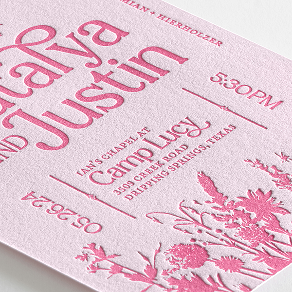
Natalya’s got some skills! So let’s take a look at what she created for her very own wedding. She chose an A7 Card with Letterpress Printing on Pearl White 100% Cotton, 110 lb. paper. Take a look at the closeup shots below and notice how crisp and clear the impression is even in a lighter weight of paper. We take great care in choosing and testing the performance of our paper options per print process and it shows! Her choice of pink letterpress ink on a digitally printed pink background turned out beautifully as well.
“As a designer, I definitely took my wedding as an opportunity to really branch out and have a lot of fun with the design. My basis for the design was pretty simple: pink and flowers. I think a simple theme really helped me refine my stationery look.”
Now let’s talk about layout!
The layout is unique and engaging, plus it complements the typography perfectly leaving just enough space to admire the special touches in her accent font. Check out our blog post Typography Tips for Custom Print if you’d like some pointers about achieving a nice, clean look in typography-based designs. The coordinating pieces also do a great job of presenting information clearly and elegantly. We love the no-fuss, organized presentation of information allowing guests to scan and take action. That’s how you get the most responses after all. Make it simple, make it clear.
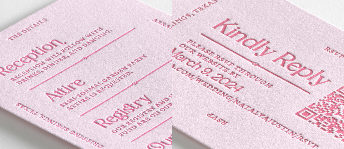
“I wanted to lean away from traditional invitation formats, which led to what I see as a more editorial layout that prioritizes information and readability! I was drawn to the letterpress medium because it brings a sense of touch into the design, which I think elevates the guest experience of receiving a traditional paper invitation.”
A quick color comparison…

The white card with pink lettering also looks really nice! Seeing them side by side is quite revealing as how much one color choice can change the mood of an invitation. This is a great reminder that testing different variations of the same design is a great way to learn and get familiar with the options here at TOG.ink. We offer a low minimum quantity of 10, after all. You can even test out a different process with the same PDF. For example, if you’re ordering a letterpress design like Natalya here, you can use that same PDF to place separate orders in foil stamping, thermography, white ink or enhanced foil. Try something new!
Thank you, Natalya, for letting us feature your custom letterpress wedding invitations as a Hot Trend Off the Press. You created a stunning piece of stationery, and we are so appreciative of your explanations around the design choices and inspiration for the whole piece. Want to see more of Natalya’s work? Check out her portfolio!
Leave a Reply