
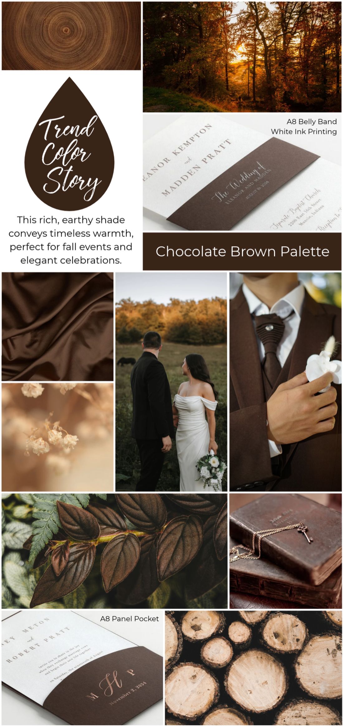
Chocolate Brown brings a rich, grounding warmth that feels sophisticated, inviting, and effortlessly timeless. This deep, earthy neutral has become a standout shade for Fall 2026, offering a fresh alternative to traditional autumn tones. Its versatility makes it an ideal foundation for wedding palettes, holiday stationery, milestone celebrations, and designs that lean into warmth and understated elegance.
Print Options that Complement the Look
Chocolate Brown pairs beautifully with warm neutrals and natural-inspired paper colors. Shades like ivory, cream, kraft, and soft taupe create a balanced palette, while warmer tones like Terra Cotta or deeper greens can add dimension and seasonal depth. Digitally printed products make it easy to achieve the exact chocolate brown tone you’re looking for, whether you prefer a rich espresso shade or something slightly softer and warmer.
Foil can also add an eye-catching contrast to this deep neutral. Gold, copper, and bronze foil bring warmth and a touch of shine, while lighter foil shades can create a more subtle, refined finish against the darker color.
Matching the Mood of Fall Celebrations
Chocolate Brown works across a range of celebrations, from cozy fall weddings and intimate dinner parties to holiday gatherings and milestone events. Its depth pairs especially well with organic textures, botanical artwork, vintage-inspired details, and clean, modern typography.
For a more elevated look, combine chocolate brown with textured papers, layered pieces, or specialty print techniques like foil, letterpress, or laser-cut accents. The result is a palette that feels warm and seasonal without being overly traditional. Whether used as the main color or as a rich accent, Chocolate Brown brings a timeless depth to fall stationery and event designs.
Leave a Reply