Warm, vibrant, and endlessly versatile, the Jewel Tone Yellow Palette is filled with energy and optimism. It’s bold without being overpowering, and it plays beautifully with neutrals, soft pastels, and even deeper jewel tones. For stationery designers looking to bring warmth and personality into their work, bright yellow details are a golden opportunity.
A Joyful Color
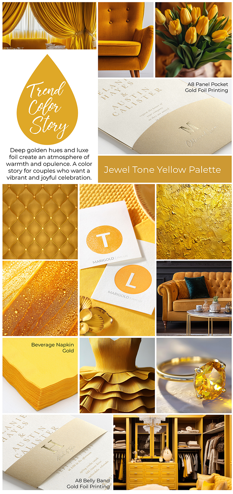
This palette isn’t shy, and it is filled with joy! Sound like anyone you know? Use it to add a pop of color to minimalist invitations, to anchor a vintage-inspired design, or to bring joyful contrast to moody earth tones. Whether it’s the star of the show or a supporting accent, yellow brings personality, style, and a modern glow to any print project.
Color Pairing Ideas
Here are a few ways we’re loving jewel tone yellow in custom print design:
- Jewel Yellow + Blush: A soft and sunny combo for romantic wedding invitations.
- Jewel Yellow + Evergreen: Bold meets grounded, perfect for fall events or outdoor celebrations.
- Jewel Yellow + Charcoal: Sleek and sophisticated with just the right touch of vibrance.
- Jewel Yellow + Sky Blue: A playful twist ideal for baby showers, birthdays, or modern announcements.
Make It Shine
To give this bright yellow hue the spotlight it deserves, consider printing with White Ink on darker paper stocks, or pairing it with Gold Foil for a gorgeous finish. Whether used in envelope liners, belly bands, or custom printed napkins, this trend-forward color adds a dose of sunshine to every suite.
Feeling inspired?
We can’t wait to see how you bring this color story to life in your next design. Need samples or looking for coordinating paper products? Let’s make it happen. Start exploring!
Leave a Reply