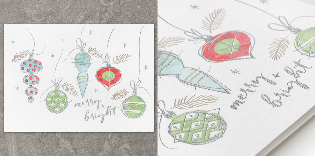
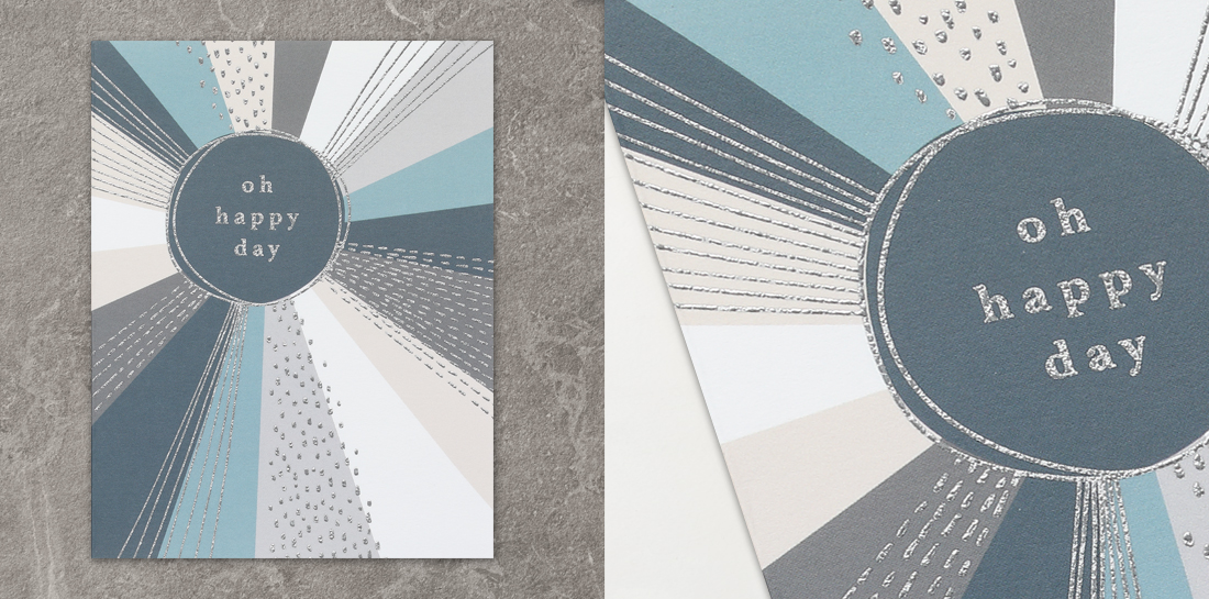
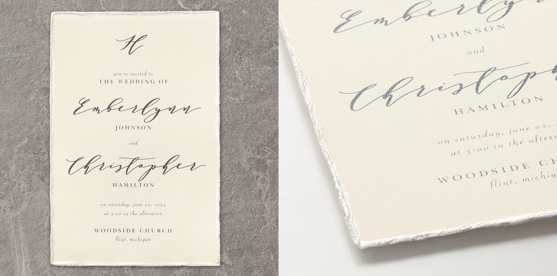
Thermography printing is a staple for seasoned stationery designers. If you’re new to the industry, however, you may not know just how pretty raised lettering can be or how versatile this print process is. You can read more about the print process in What is Thermography? but today, we’re looking at tips about when and how to use custom thermography in your stationery designs.
10 Custom Thermography Tips for Designers
You can always trust the creative team here at TOG.ink for some expert knowledge and helpful hints. Our in-house stationery designers and art directors have sprinkled in a few thoughts to help you dive into the world of raised print!
1. Boost Your Profits
Thermography (a.k.a. raised printing) is an extremely affordable specialty print process. Raised printing can add a special look and feel to pretty much any printed piece, from wedding invitations and holiday cards to corporate mailings and business cards. If you get familiar with it, custom thermography is a process that can really impress customers.

2. Add Sparkle
Thermography inks, paired with the resin powder used to raise it off the paper, leave behind a subtle sparkle you’ll love. Some colors add more sparkle than others so it’s best to run some tests to try out a few different thermography ink colors. Gold is a huge favorite—it never disappoints!
“My favorite kinds of art to use for thermography are detailed line art, patterns and text-only layouts.” – Catt, Stationery Designer
3. Add Texture
As a print designer, you appreciate the entire stationery experience, from print to paper to envelope. So you can understand how thermography adds to that experience! The raised print adds texture to the piece for a low price you can’t beat and a tactile feel you can’t ignore.
4. Add Depth
Make the most of the raised effect! Experiment with elements that can add depth to your designs like accent fonts in typography layouts, detailed borders, monograms and even business logos. Custom thermography is a great way to create a focal point on any printed piece.
“For a specialty print process, the level of detail you can get with thermography is pretty amazing!” – Todd, Stationery Designer
5. Pair it Up!
Thermography pairs beautifully with our most popular print processes! The top-selling pairing is digital + thermography followed by foil + thermography, then thermography + letterpress. The raised printing is a fun way to add detail and dimension to these pieces.

6. Try 2-Color Thermography!
You can add a second color to any thermography item. The option will appear when you choose to customize your item and are ready to upload your art. Just upload a separate PDF for each ink color (same specs for each). There is a minimal extra charge applied after the second PDF is uploaded. Just remember to read Designing for Print for registration tips!
“Thermography is truly timeless. It’s a staple for our design team on wedding stationery because it adds an extra level of detail that makes wedding invitations and fine stationery look and feel special while remaining affordable.” – Jenn, Creative Director
7. Accentuate Design Elements
Thermography + digital is a popular pairing for a reason. Creating a digital design and then determining which elements in that design could be enhanced with thermography ink is an excellent way to bring your stationery design to a new level of beautiful!
“When I use thermography in my artwork, I tend to go with black lettering or detailed line art paired with digital full color art. The trick with this combo is that the thermography layer may not register exactly to the digital layer, so keep that in mind. Oh, and remember, 1 color does not mean greyscale!” – Anna, Stationery Designer
8. A Better Match for Envelopes
When trying to match stationery ink colors with printed envelope ink colors, it’s best to choose the same process. Thermography uses offset printing inks, and we also offer offset printed envelopes. If you choose thermography printing and an offset printed envelope to coordinate, the colors should match up better than if you choose digital printing and offset envelopes. This doesn’t matter for all colors but it’s very important for some color families like blues and purples. Check out Periwinkle, the Problem Child.
9. Take Stock of Stocks
The paper stock chosen will either accentuate the raised printing or detract from it. You will never go wrong with our standard white and ecru smooth papers. Textured stocks also look nice but if you really want to showcase the sparkle and texture of thermography, you may not want the paper texture to compete with it. Shimmer stocks are really hit or miss. Sometimes it looks great, sometimes the shimmer paper steals the show. Run a few tests to determine what you like best!
“My favorite stocks to use for thermography are clear and shimmer stocks. I think these make the thermography pop the most.” – Catt, Stationery Designer

10. Color Matters
The color of the paper or digital printing colors can affect how the thermography ink looks. For example, sage thermography ink may look warmer on cream-colored stock as opposed to looking “true to color” on white stock.
“People don’t realize how many ink colors are available for raised printing…I mean, 40+ ink colors leaves a lot of room to get creative.” – Eric, Art Director
Leave a Reply