I went to one of our product designers last fall and asked him if he could put together an abstract art design with one of our wedding invitation pockets. I also asked him to include a custom print ribbon. I’m sure I provided some examples of what I liked for designs but…
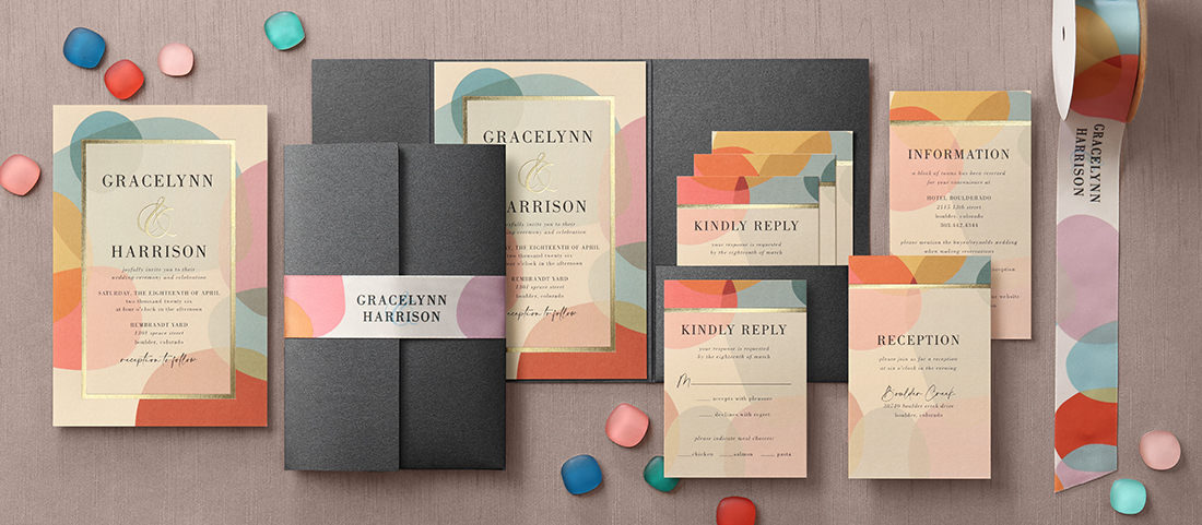
Look at this pocket wedding invitation!
I may have asked him for an abstract art invitation but honestly, I feel like he gave me a masterpiece. I’m tempted to frame it all and hang it on my office wall it’s SO beautiful. He’s been designing wedding invitations for years, so he’s a pro and it shows! Enough about how much I love it though, let’s talk about what’s in it because guess what? You can do this too!
The Pocket
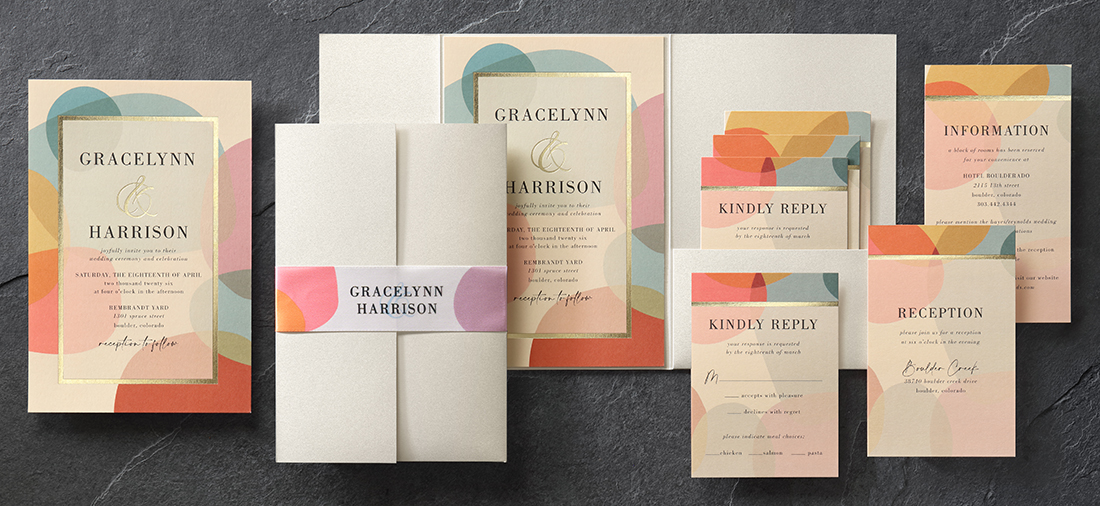
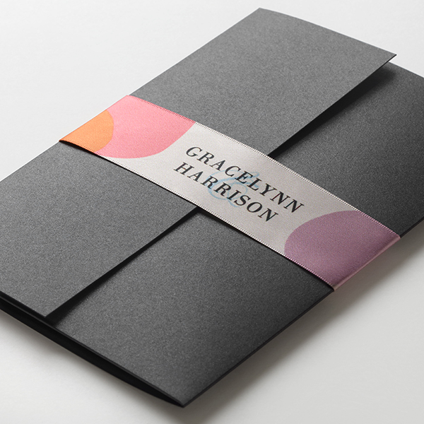
We chose the gatefold pocket for this ensemble because we thought it would go nicely with the custom print ribbon. The wedding invitation and all of its coordinating pieces are so nicely arranged in this pocket that it’s pretty easy to love it. We chose the A8 pocket size since a larger pocket and invitation adds to the dramatic effect of the design itself. You can see the invitation shown with a black shimmer pocket above and an ecru shimmer pocket below. Both look amazing!
Pockets are a bit tricky in that different sizes of cards are required depending on what size of pocket you choose. Make sure to pay attention to the product details. Be sure to Check out the Cheat Sheets if you need more information about how to create your own custom pocket wedding invitations on TOG.ink. They’re available on every pocket’s product detail page.
The Cards
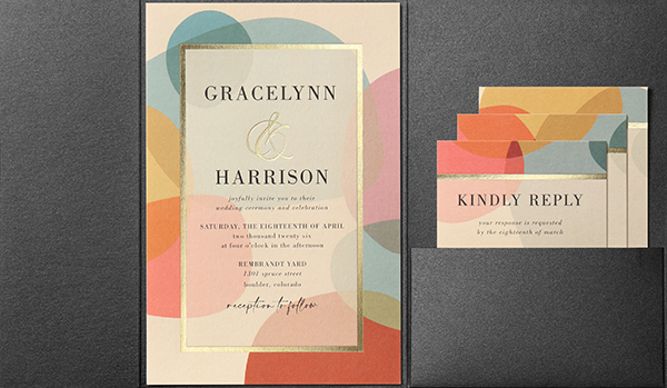
We chose an A8 flat card in ecru for the invitation card. We also chose ecru for all of the enclosure cards. We offer the same three sizes for our stacked enclosure cards no matter what pocket size you’re ordering — A1, R6 and R7. These three cards are sized to tuck neatly into the pocket located on the right panel of the gatefold pocket. Since the pocket comes with glue dots, you can attach the invitation card to the center panel quickly and easily.
Just a few notes about flat cards for pockets. The A7 size pockets require R5 flat cards for the printed invitation cards. You can add an R4 layer card if you like. The A8 and A9 pocket sizes are more straightforward in that they require A8 and A9 cards as the printed invitation cards. Cards sized for layering with A8 and A9 cards are not available.
The Print
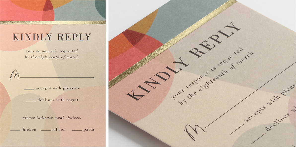
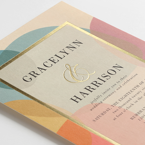
We went with digital printing for the abstract art design on this custom pocket wedding invitation, and we chose foil-stamping to accentuate the design. The design’s vibrant colors turned out beautifully and the gold foil stamped frame wrapped around the wedding invitation wording is stunning. A well-placed ampersand in the right font will elevate the design of any wedding invitation. The designer took it one step further and chose to have the ampersand foil stamped just like the border. This draws attention to the couple’s names while also bringing a nice glow to the overall piece. The designer chose to hit the top of each enclosure card with a coordinating design and gold foil border as well.
The Ribbon
To finish the piece, we wanted to show off our ribbon printing capabilities. The custom print ribbon the designer created for this piece looks amazing. It’s a 1.5” width satin ribbon printed with the same design as the invitation and the colors match beautifully. We wrapped the ribbon around the front of the invitation and used a glue dot on the back to secure it. The product designer had another SUPER CUTE idea for tying the ribbon (see farther down).
The personalized ribbon lends such a polished and customized look to this pocket wedding invitation, that you simply have to start experimenting with your own ribbon to see how you can start incorporating it into your custom wedding invitations and more.
Eye Candy for Designers
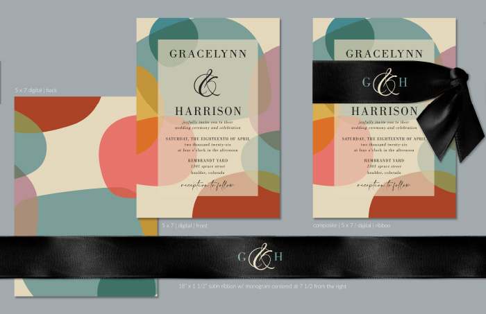
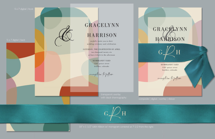
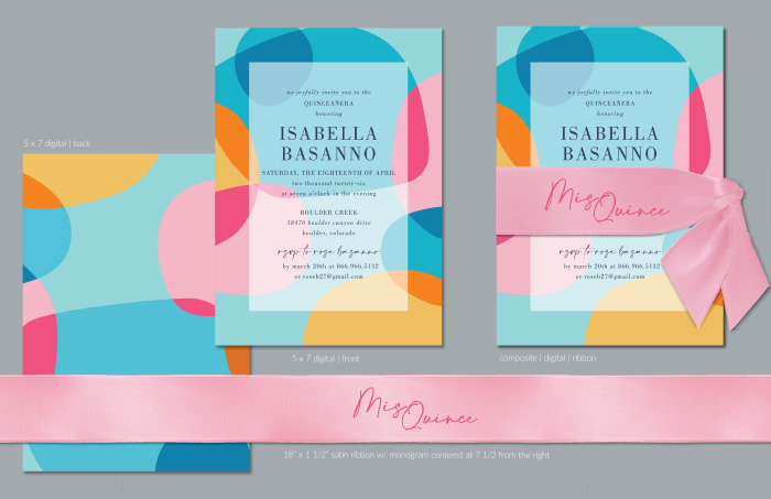
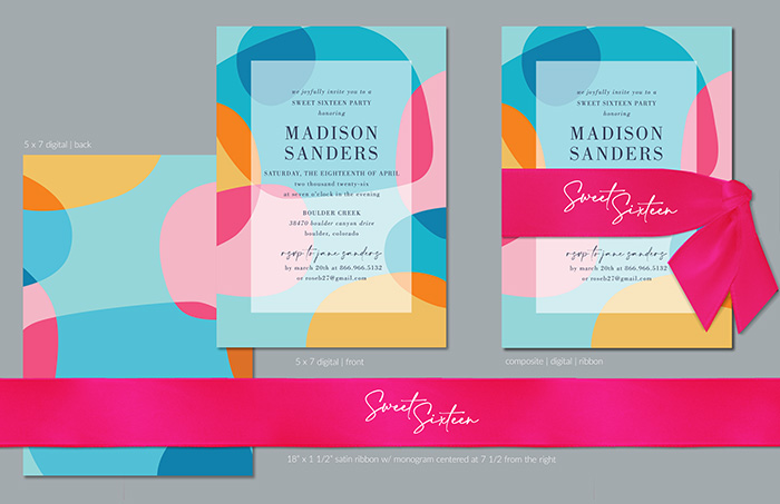
Todd is such a pro, he provided several composite PDFs when we were first running through concepts for this piece. The different color combinations are incredible. I wanted to make sure you all got to see how changing up the color palette or even just the ribbon color can change the look of the whole piece. So here are the composites he provided to me before we landed on what we would put through for printing and photographing. You can ignore some of the details in fine print.
Leave a Reply