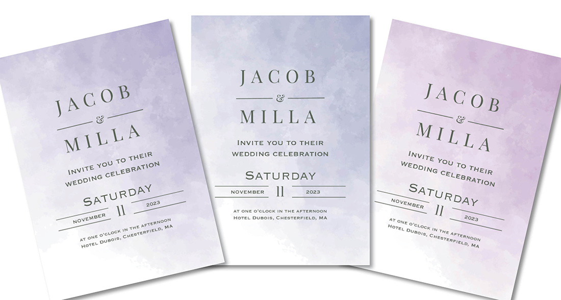
There’s this one color in the print industry that has been causing issues for decades. It has the most beautiful name, almost whimsical in nature. Periwinkle. But have you noticed the “wink” in Periwinkle? A nod to its tricky nature, no doubt. Press operators and color management specialists across America have said that very pretty name in not-so-pretty ways more than a few times.
Periwinkle…
Ironically, the color is so pretty that it happens to be one of the most popular colors in wedding stationery. Go figure.
So why is periwinkle such a problem? To be fair, it’s not just periwinkle. The blue color family in general can pose challenges. Slate might just be the big brother to periwinkle in terms of “acting out”. Shades of blue are extremely sensitive. As I was told by one of our color management experts, blues (especially periwinkle) can teeter on the verge of being perfect, but the slightest change in variables (type of paper, print press, ink load, etc.) can cause it to change and look a little bluer or a little more purple. And that slight difference is very noticeable in these shades. It’s a known issue in the print industry across processes, whether we’re talking something handcrafted like letterpress or totally automated like digital.
Color consistency can befuddle even the most experienced of press operators let alone those who are new to the craft and learning. Now does that mean we want to boycott periwinkle? No, I mean…some days…well, is it an option? No! Periwinkle is beautiful and we love it as much as you. We will do our best to overlook its faults and love it just the way it is, even if it changes for no reason at all.
So how do we manage this issue?
The Occasions Group has been awarded the G7® Master Qualification by Idealliance for our digital printing, which means we use the most modern technology, techniques, proofing and press control standards available to produce a close visual match from proof to print. As for other printing processes like thermography and letterpress, we do allow our customers to send in a sample if they have an existing item they want to match. A sample can help our press operators match color, ink coverage and depth of impression (for letterpress items).
Issues may still arise if an order has pieces printed on a digital press (like an invitation suite) and pieces printed on another press (like envelopes). Periwinkle and slate are major culprits in this category and, to be perfectly honest, aren’t the best choices for envelope personalization if you’re looking for a perfect match. However, we have an excellent customer service team to help with these situations.

Leave a Reply