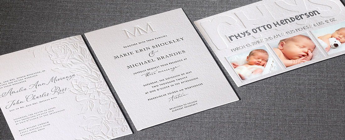
Part of my job as an Art Director is to spot stationery trends hitting the market. An emerging trend I’ve had my eyes on is blind embossing and blind debossing. What’s interesting about blind embossing and debossing is that it’s nothing new but it has taken on a whole new life recently in the world of fine stationery.
Blind Embossing vs. Blind Letterpress
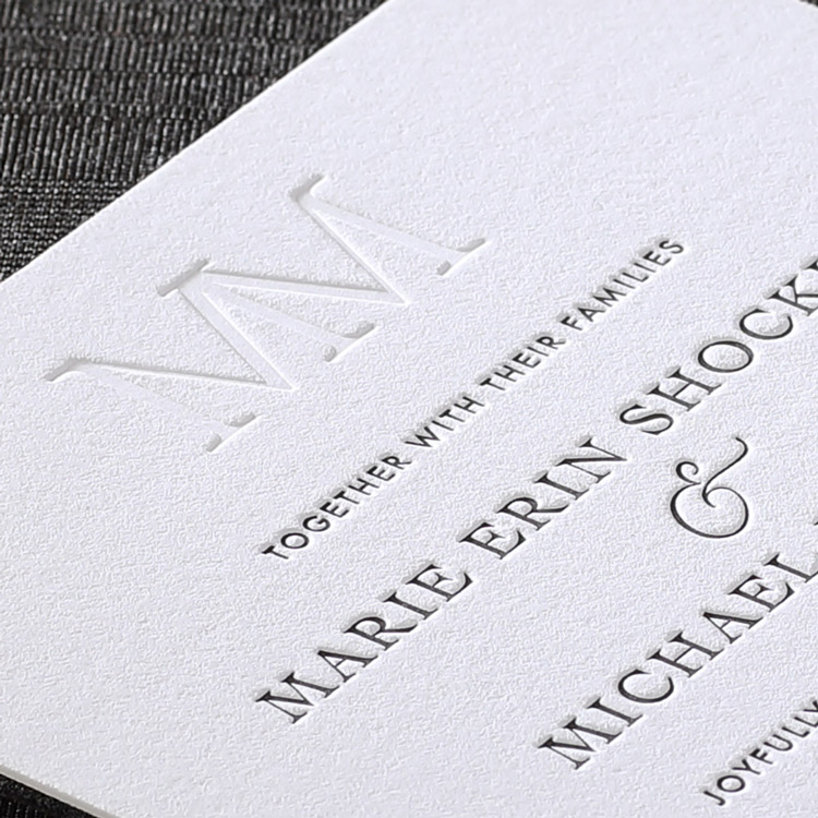
Embossing is a traditional finishing technique that results in a design that’s raised off the paper. The term “blind” simply means no ink color. We’d love to offer custom embossing but since it requires two dies (or a punch and a die), we can’t offer it at a reasonable price point for custom stationery. We can offer a form of blind debossing through our custom letterpress stationery. Our letterpress is achieved through the use of one polymer die but the design and/or wording is pressed into the paper resulting in a blind debossed look.
“Who knew a design could appear so vibrantly in the absence of color, relying on shadow definition from the heavy impression to create such incredible detail. It’s pretty cool if you ask me!” – Eric Manske, Art Director
We’ve been seeing some really nice blind letterpress stationery designs coming through, and luckily I’ve gotten permission from these talented stationery designers to share their work with all of you. Already know you’re interested? Read up on How to Order Blind Letterpress to get started.
Designer Examples You’ll Love
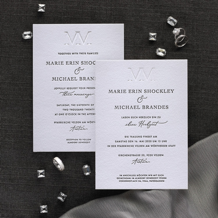
First up is a super simple but very sharp monogram wedding invitation by Foglio Press. The monogram is blind debossed at the top, and since we only offer top-quality cotton paper for our letterpress, you can see how beautifully and cleanly this angular monogram is pressed into the paper. The neat thing about blind embossing/debossing is that it’s very counterintuitive.
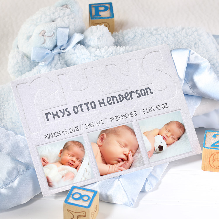
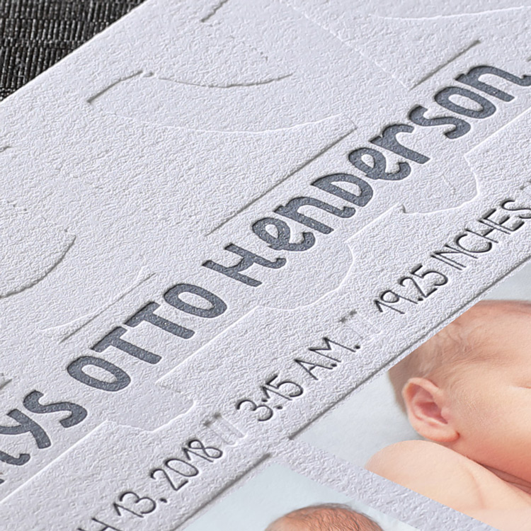
Next we’ve got a super unique baby announcement. What I love about this piece is that the Paper Heart Company used the letterpress technique to create “frames” for printed baby photos, which the couple added before sending to friends and family. The child’s first name appears in a big, bold font reaching across the top and creating an intriguing background for the full name. This announcement is a fun combination of fonts and full-coverage letterpress design.
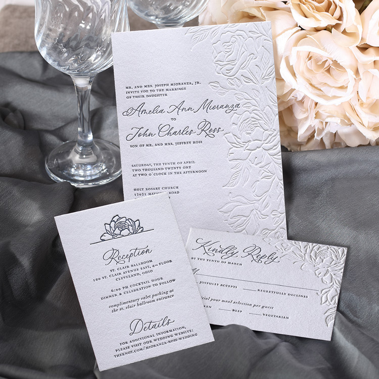
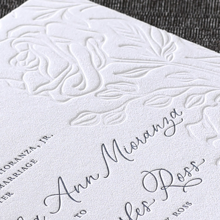
Lastly, we’ve got a truly beautiful floral wedding invitation by Brianna Barnard. Notice the incredible detail in the roses and how the blind debossing almost magically creates this flourishing floral pattern. The depth of impression paired with the edgy illustration style is really stunning and couldn’t be more perfect for a wedding invitation. Not to mention the floral pattern is carried throughout the entire suite. Stellar work, I must say!
Now is a great time to explore the depths of what you can do with letterpress, and we highly recommend experimenting with blind letterpress if you haven’t utilized the technique already.
Leave a Reply