Today we’re talking about designing for print and we’re digging into letterpress specifically. Letterpress printing is really, really old – but in a good way! The short and sweet of the process is that pieces begin as digital designs, which are sent to film as a negative and then exposed to a plate. The plate (a.k.a die) is then pressed to individual sheets of paper. A heavily impressed image on thick paper creates debossed designs and wording that are crisp and sharp.
Designing for Lettepress: What you need to know!
Letterpress inks are not mixed on the fly, as they are when running through a digital printer. They are carefully made to order using the Pantone Matching System (PMS) color breakdowns. Here at TOG.ink, we use rubber-based inks from Van Son Holland Ink and oil-based inks from Sun Chemical, which are matched with Pantone colors. The first thing you want to do when designing for letterpress is to select an available color here. If you select from our letterpress ink palette, the final result will be exactly what you expect. Otherwise, you will need to change your custom color to the closest match available when uploading your artwork. (One thing to note, letterpress inks are transparent inks so they will take on characteristics of the paper behind it, which may cause the color to vary slightly.)
Letterpress Options at TOG.ink
TOG.ink can print 1- or 2- color letterpress on your choice of 100% cotton papers. We offer pearl white and fluorescent white in 110 lb. and 220 lb. weights. You will need to determine if you want your design in 1 or 2 colors and what size you want the final piece to be. Once you determine the stock size, you can get a template on the product detail page to be sure the final result will come out exactly as desired! When you download the template, you’ll see we offer bleeds on all four sides. You’ll find other helpful details, too.

When You Start Designing
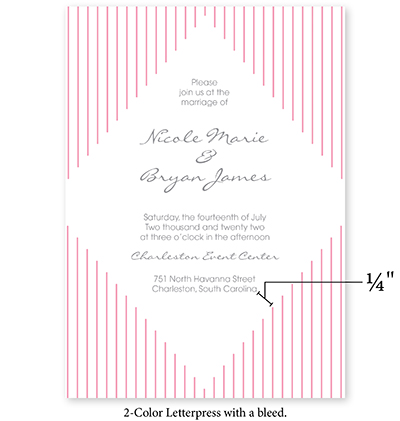
There are a few things to remember that can make or break the design. It is not advised to use fine lines or very small fonts due to the die not being able to pick up the ink every time. If the die doesn’t pick up the ink, the design or copy will look broken. When designing for 2-color letterpress, you want to be sure there is a minimum ¼” between each color because the inks will be printed separately and the registration has about 1/16″ play.

Before You Upload Your Artwork
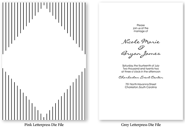
Artwork needs to be converted to 100% black bitmap. Why? The artwork is being used to create a die. For 2-color letterpress, you will need to upload two PDFs, one for each color. Each PDF will need to be 600 dpi and 100% black. A good practice is to separate each color into its own layer in your file so you can easily separate the colors after they are converted to black.
When Saving/Exporting Your File
- Choose the “high quality” option.
- Name your file with letters and numbers only (no special characters).
- Uncheck “preserve editing capabilities” (if using Adobe Photoshop or Illustrator).
- Hide all non-art and template layers.
Once the artwork is uploaded to TOG.ink, you can select the desired ink color and the site will generate a preview for a final check before it is sent off to press. You’re going to love the end result!
Are you interested in blind letterpress (a.k.a. blind deboss)? This has become a popular trend in the last few years, and it’s easy to do here at TOG.ink. Check out our blog post How to Order Blind Letterpress to learn more!
Leave a Reply