Every year we wait with anticipation to see what the Pantone color of the year will be, and every year we are surprised and delighted by the refreshing choice.
This year, we are 100% behind Pantone’s choice of Classic Blue and the meaning behind it. If you haven’t read Pantone’s 2020 announcement, we highly recommend doing so but the leading statement says it all: “Classic Blue instills calm, confidence and connection, this enduring blue hue highlights our desire for a dependable and stable foundation on which to build as we cross the threshold into a new era.”
Does that sound like something you can relate to? We think so, too.
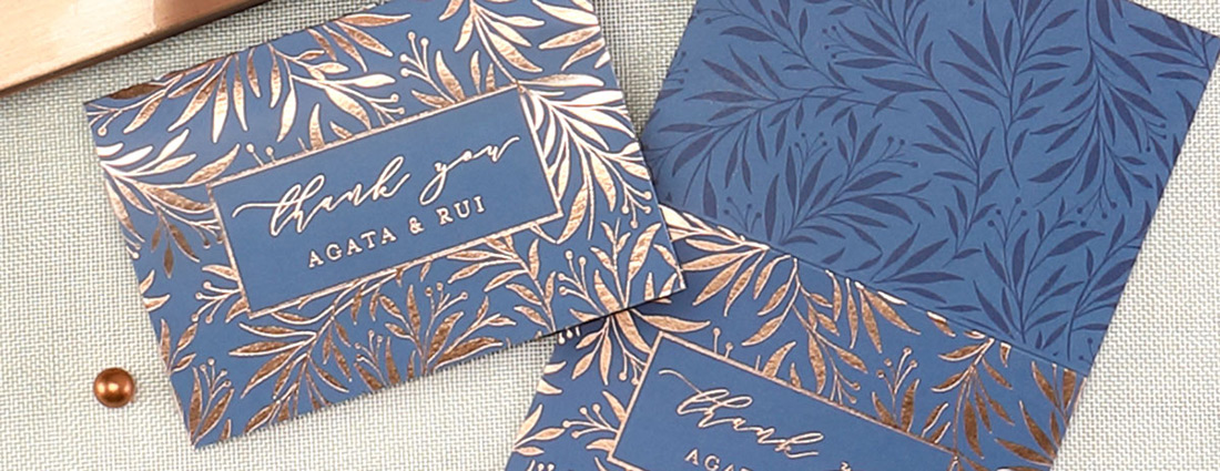
Now imagine the stationery you can create with this color, whether it celebrates life’s special occasions or supports the hardworking businesses you work with. We’re already seeing some great examples of this calming color on paper like the thank you card featured above by Melanie Kosuge. These thank yous are printed on 130 lb paper with a blue flood coat and sparkling rose gold foil. We’re so grateful for Melanie’s stunning design.
Now imagine what you could do!
Leave a Reply