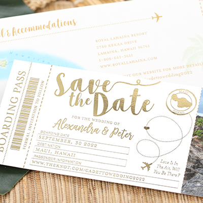
Over the past several months, as I look thru beautiful wedding pictures and senior photos from family and friends, I am reminded of The Color Trends 2022 Palette from Benjamin Moore and just how stunning the colors are!
I have seen an abundance of these subtle colors (sometimes referred to as muted, pale and misty). What has really stood out to me is when they’re mixed with natural elements like dried florals, grasses and wood. The combination makes for spectacular design! Just check out this custom wedding invitation featuring dried florals in muted colors from White Ink Calligraphy. You’ll also notice the textured look of thermography in gold ink.

TOG.ink offers smooth and textured papers from bright white to ecru but did you know you can print your design on a trendy colored stock? We offer some great Mohawk papers in some of these muted colors. Here are a few options with its closest match from the Benjamin Moore color palette:
– Biscuit matches closely with Benjamin Moore’s Natural Linen.
– Ecru Texture matches closely with Collector’s Item.
– Cobblestone is a neutral light warm gray without a close match.
– Old Rose matches closely with Benjamin Moore’s Wild Flower.
– Matcha Tea matches closely with Benjamin Moore’s High Park.
The Vows Booklet below by Dill Paper Company is a sweet example of how choosing colored paper stock can add a nice richness to the overall look of the custom print piece, and just look at how the gold foil stamping glows against the Old Rose paper!
Take a look at that same combination but with a gold floral pattern on a digitally printed background featuring a finer line weight — it still stands out beautifully against the rosy paper! This color combination is simply divine, and I love how Eileen Adam from Noteworthy Expressions included wording in reversed-out white to give it a super fresh look.

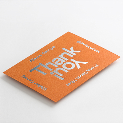
I’m a big fan of the digital + foil print pairing on this set of three thank you cards from Images of Old Greenwich, Inc. The flat cards feature digitally printed, solid color backgrounds in three beautiful muted tones and the wording stamped in gold foil.

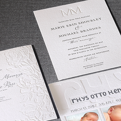
Of course, we would be foolish not to highlight the timeless beauty of letterpress paired with a muted ink color, which highlights the crisp letterpress craftsmanship in this absolutely adorable design by Sarah Sorrentino-Noble at Foglio Press.

With life getting back to a new normal, events back on and people gathering, this color trend will continue for a while as people choose these calmer, gentler colors that give a feeling of safety and simplicity. I hope the gorgeous printed pieces shown here from super talented designers just like you help inspire you to create something amazing!
April 14, 2022
Author : Carynn
Title: Senior DesignerYears at The Occasions Group: 29 years
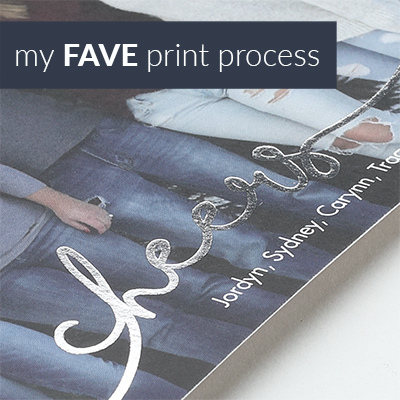
Favorite Print Process: Foil
Secretly I’m really good at… lip-syncing 80s hair band music.