One of our goals at TOG.ink is to help you design your amazing stationery with print in mind because we know the print side of stationery can be a little complicated. However, most of the errors we see when designing for print can easily be avoided, so I wanted to let you know about the five most common mistakes we see and give some tips that will help.
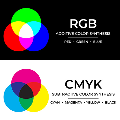
1. Color Mode:

There are two standard color spaces available in design programs. Adobe InDesign, Photoshop and Illustrator use CMYK and RGB. You can design in either color space when designing for print but if you design in RGB, which is standard for digital design, your artwork will be converted to CMYK. Why? Because digital printers print in Cyan, Magenta, Yellow, and Black (CMYK). The design program you’re using will allow you to preview your RGB design in CMYK so you can get an idea of what it will look like when printed. However, if you want your color to be 100% accurate from screen to print, it might be best to start your design in CMYK to avoid conversion and any color variance. Otherwise, you can design in whatever color space you want and our job is to get as close a color match as possible.
2. Resolution:

Digital printers look at the dots per inch (dpi) to gauge how much ink is needed in all areas, which controls the clarity of the image or artwork. There are two main dpi settings when you create a document: 72 dpi and 300 dpi. 72 dpi will look nice on a monitor and is ideal for digital designs, but digital print looks best with a minimum of 300 dpi. Therefore, ideally the image or artwork you upload would be no less than 300 dpi. We ask that digital artwork uploaded to TOG.ink be at least 300 dpi and files for other print processes like letterpress or thermography should be 600 dpi. When designing for digital, you’re probably used to shrinking images down to 72 dpi. Since print design needs a higher resolution for better print quality, it’s important to remember that you should never save your image or artwork up to reach 300 dpi. The resolution will often be poor, which is bad news for printed products.
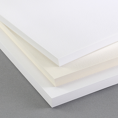
3. Sizing and Bleeds:

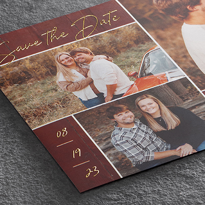
The third thing you want to pay attention to is the size of the product you’re designing for and whether or not your artwork will bleed. The bleed is the part of your artwork that will be trimmed so the art can fill the entire stock. If you want your artwork to fill the printed piece from edge to edge, a 1/8” bleed should be included in your artwork size so it can be trimmed and provide the cleanest result. We provide the “artwork size” with bleed for every product at TOG.ink. We also provide templates on each product’s detail page. We highly encourage using the template!
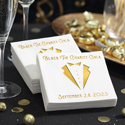
4. Contrast and Registration:

The next thing to watch for when you are designing for print is using small font sizes and thin lines in your artwork. This most commonly comes into play with white text or strokes on a solid colored background. If the text and strokes are too thin, the ink might fill in depending on the stock (uncoated paper tends to absorb ink much more than coated stock).
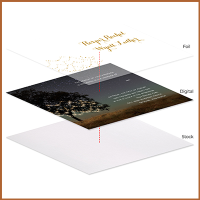
Also, pay attention to the registration when combining print processes. There is a 1/16″ play in all of our print processes due to stock and cutting variances. If you’re trying to line multiple print processes (say foil and digital) in a small area, the design can vary from card to card. Printing and cutting every single piece in the exact same way and not expecting a little bit of play is close to impossible given the level of manual craftsmanship involved in printing fine stationery. We will be covering registration in depth at a later date, so stay tuned!
5. Spell Check and Font Formatting:

Granted, paying attention to spelling and font placement isn’t unique to print design but these kinds of mistakes become a much bigger problem in print. Nothing can ruin a beautiful design like getting it back and noticing there is a typo. Use spell check and have multiple people proof the design. The layout of the copy can be overlooked during the design process as well. Some fonts are designed to be very close together; your screen shows it exactly how it should look but that may not be the case after it is printed. It’s important to look at the tracking and kerning (the spacing between letters and words), and think about whether it will be legible when printed. The Artwork Specifications and File Requirements grid can be of help here.
Check back with us soon! We’re starting an entire series dedicated to Designing for Print. First up is Letterpress. We know we’ve got some fine stationery nerds out there who will want to check it out!
April 25, 2019
Author : Joshua
Years at The Occasions Group: 8 yearsFavorite Print Process: Letterpress
Secretly I’m really good at…not many people know that I curl but I wouldn’t say I’m really good at it? I really enjoy it though!